Ek, Do, Teen, Chaar,
Paaanch, Chhah

(One, two, three, four, five, six)

This is a bilingual book about my family's history. It’s a look into all six siblings' lives detailing their experiences, relationships, memories, and perspectives while growing up.

My Objective
With design I wanted to highlight the dichotomy between nostalgic and romanticized feelings that often come when looking at old pictures with the harsh and raw words presented alongside them to express how looking through one lens can skew things.

Design Concept
One of the biggest challenges I faced was how to differentiate between the six oscillating speakers in a coherent yet interesting way to the reader. I solved this by creating a typographic hierarchy system using indents that were determined by order of birth. The eldest got one indent, the second got two indents, and so forth.

Another significant part of this book is language. Prior to designing, I spoke to everyone separately to gather content. While conversing we naturally switch between languages and in an effort to keep the authenticity I decided to keep this fluctuation in the book. However, this posed a difficult design problem which I resolved through the use of color. The left page always had the full transcribed text with both English and Hindi, just as it was spoken. However, the Hindi parts were all greyed out. On the right page only the translated sections could be seen in the exact same location as the untranslated Hindi on the left page. Not only does this visually engage the reader but helps them decode the conversation intuitively.

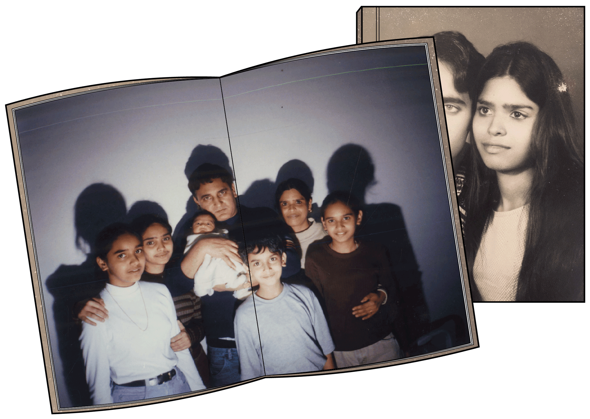
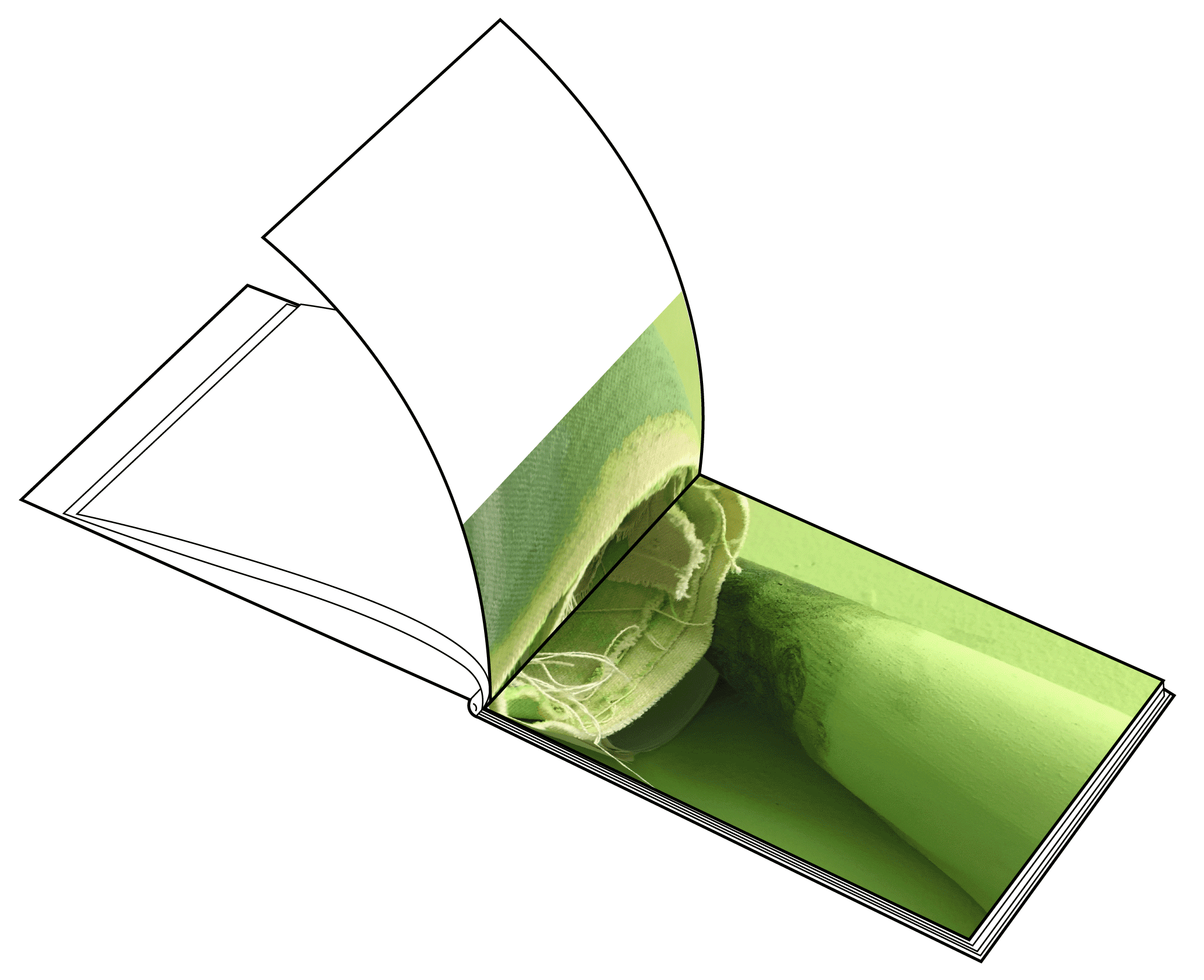
The last component of this book was imagery. I not only used pictures within the book, I used scans of old albums. The album had a notes section beside the image slots where my family would write captions. I included this to showcase the personality and playfulness that was always emulated despite the reality of things — coming full circle to my objective.


Green Myth

This was a concept in which I was given a set of images taken at a studio filled mostly with the color green and asked to make a book with them. These particular set of images were challenging to work with because many of them looked so similar and only had one color to work with.

When I looked at the images together it became a blur of green but got struck by a moment of inspiratoin. I decided to make an abstract composition. I took a step back and carefully looked at each image to hone in on the details and the differences. To allow the viewer to experience those details I cut each picture into slivers. When I put these slivers side by side I saw how a color pallette of this studio was beginning to form. The layout started to express the saying "it's always the small pieces that make the big picture."

I fell in love with this idea and how it executed visually so in the end the book was designed as a mix of these slivers and some highlights of the more striking and beautiful images.


The Day After
Tomorrow

⁠— Images of Our Earth in Crisis

This is a redesign of an existing book that has compelling imagery and discusses an important subject, planet Earth. The original set up of the book weaved images, essays, and captions togethher throughout the book.

Redesign Concept
My goal for this book was to gain the viewer’s interests through all the beautiful imagery and shock them when they realize what they’re looking at are pictures of the earth in crisis. I wanted to take that shock and intrigue to make them dive into the essays. In an effort to accomplish this I decided to increase the size of the pictures to feel more dominant. I moved all the verbiage and notes to the beginning of the chapters and used a different paper size. This was very intentional because I wanted the essays to feel like they were inserts, almost like little pamphlets within the book. This also allowed for them to act as section separators for the pictures and content.

Binding & Materiality
Having two different sized papers created a binding predicament. I used the Japanese stab binding technique so the smaller pages are seemlessly weaved with the larger ones. I also felt like it added a unique touch to the book that might draw people visually to pick up the book. Another element I wanted to consider, given the content of the book, was materiality. I wanted the book to have an ecofriendly quality by using all repurposed papers to convey the mission of the book within all aspects of the design.


← Previous Project

Next Project →