Filling In The Gaps
— A Micro Version
We all have our individual stories but collectively we start to form a different one.
So how do we talk about memories? How do we give form to collective storytelling?
This is where the basis of this project comes from and one of two explorations into this concept.
Background Information
My family lost a lot of our photographs from India, from before I was born. I come from a big family with five other siblings but uniquely
I have a big age gap between all my siblings. Growing up in such a unique circumstance and with very little documentation about the family
before the move to America I felt like I didn't know a lot about my family's history. This project was a way for me to create a makeshift
map of our lives as a family unit. I wanted to quite literally fill in the gaps. But also an attempt to create a platform to help
family's keep track of their history and experiences that might otherwise be forgotten over time.
Design Concept
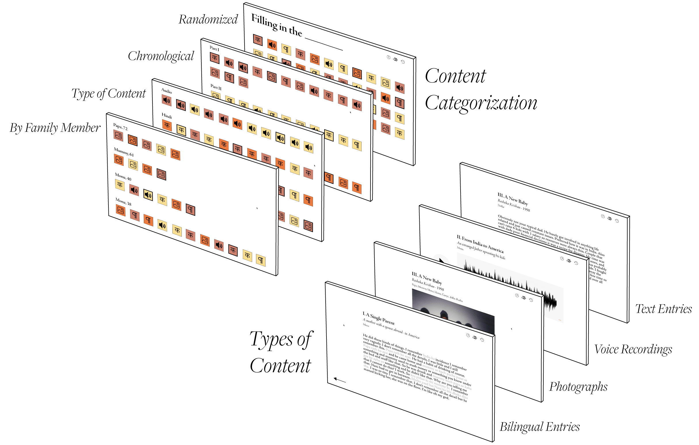
I designed this interface to feel fragmented to imitate my experience piecing things I learned together while growing up.
Never really getting the whole picture but rather bits and pieces. For that reason I made a conscioius decision to organize the website by
splitting the different types of content and start the interface off with all the memories in a random order.
As I was designing I realized by breaking the content up by type I could rearrange the data in various ways.
The different categorization types was really interesting to me because I felt like it gave the users options to chose how they wanted to
learn the narrative.
It felt as if I was taking this idea of collective storytelling and consciousness and weaving multiple experiences into one story through
this platform. While also allowing the user the autonomy to learn the way they want to and take in as much or as little information
as they wanted — allowing them to form their own journeys, stories, and conclusions.

